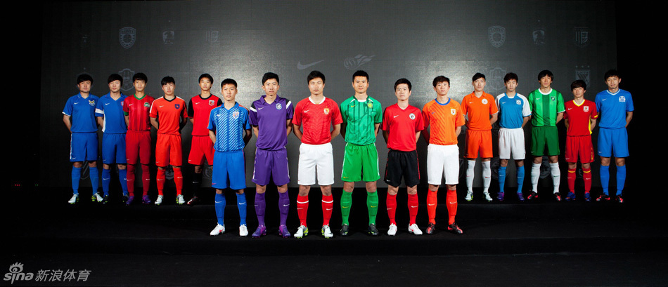
2012/02/28 Update: We’ve finally had Nike’s press conference presenting the “new” kits of 2012 (very few are actually new designs) and so we’ve updated the post to include a number of the new photos. Nothing unexpected beyond Guizhou’s new logo and slight color change.
We may not have a full schedule yet, but at least we have some idea what the kits will look like in the upcoming season. There has yet to be an official announcement, but we at have got our hands on the pictures put out by Nike as to what your side will be wearing in 2012. Fortunate for fans (but not for kit lovers), many of the teams will be wearing the same kits as they did in 2011 (for a decent roundup of 2011 kits, click here).
Beijing Guoan

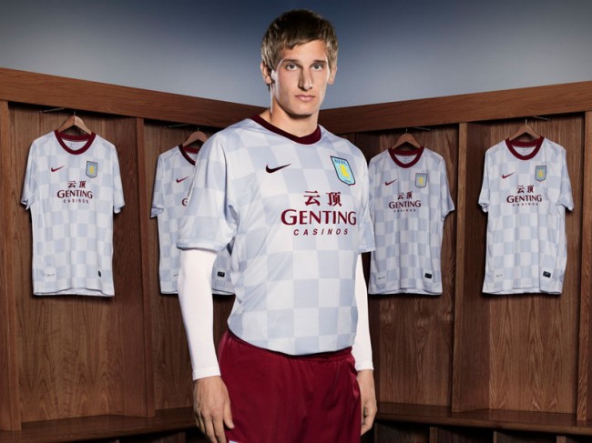
The Men in Green will keep their “watermelon skin” home kits this season though there will probably be some slight adjustments (or the Chinese Super League’s first ever retro kit pulled out at least once) in honor of the club’s 20th anniversary this season. The away kit (typically only seen once a year against Hangzhou) will feature a checkerboard pattern, using the same Nike template as Aston Villa.
Changchun Yatai

No change for the northernmost club in the league. They’ll be wearing the same red and yellow kits at home with a road kit that keeps the yellow accents and changes the red for white (here’s an updated shot of the actual shirt).
Dalian Aerbin

This was the design I’m most interested in seeing because the club has yet to be Nike’fied. Their former kit deal was with Kappa, but of course the Chinese Super League has a multiyear agreement with the Beaverton behometh that is Nike. Unfortunately, they didn’t spend a lot of time on this design, a very simple blue, most likely the away version will be white.
Dalian Shide

The team from China’s soccer city will keep their same home kit in 2012, but they do get a new road design, unfortunately its along the lines of all the other Nike away versions, a very boring, solid white kit.
Guangzhou Evergrande

2011’s league champions get a new kit in 2012, this one featuring tiger like stripes across the front. On the road last year they wore yellow and blue, but we’ve yet to see what their design will look like in the coming season but this year they’ll be outfitted in a hideous yellow top with the same tiger stripe subliminal print alongside a polo color and button placket.. Of course, like the home shirt, the most important new element will be the star above the logo. I just realized why I hate their home kit so much, it’s based on Manchester United’s kit template.
Guangzhou Fuli

The other newly promoted side has a kit that looks a lot like Aerbin’s, the same solid shirt, a royal blue shade, though they don’t have a collar, instead theirs has a white neck line. We don’t know what the away shirt will look like, but solid white would be a good guess.
Guizhou Renhe

Not sure what to expect out of this now Guiyang based club. During the preseason, they’ve been wearing their old kits, but this has been common throughout the league, so its not a sign of anything. I have seen a photo or two showing Gao Hongbo wearing a very different logo from the one used in Shaanxi, so perhaps we’ll have something new to look at from this club.
Update: So now we see the new logo and home shirt, I love the logo, though a fellow writer sarcastically commented that we may only see it for another year or two before they move again. Fair enough, but it’s a damn cool logo. I give them credit for getting rid of red, a very common color in the league, though this shade of burnt orange doesn’t get me excited. However, it is rare, so maybe it will grow on me. We haven’t seen an away kit, but I’m guessing white.
Hangzhou Greentown

Hangzhou will continue their battle with Beijing for team that looks the most like a watermelon, keeping their same home kit as last year. However their away kit is a new design, a good looking one too, unfortunately it only gets seen once or twice a year.
Update: Here’s a better shot of the new home and away kits.
Henan Construction

As much as I dislike the Zhengzhou based club, the dark red and green of their kit really works together. Their new version features subliminal stripes and is probably my favorite among the new designs. I also have to give them credit for a non-white away kit, this year’s version will use the same template as the home kit, except in blue and white.
Jiangsu Sainty

The Nanjingers also get a new kit for the upcoming season, unfortunately for them its from a very strange template and isn’t an improvement on their 2011 design. It could be the picture, but it looks like a darker shade of blue is being used this season, too bad if that’s the case as their sky blue and orange kits from the past few seasons were striking. Their away kit is the reverse of the home kit done up in white. Here’s a better shot of the home kit.
Liaoning Whowin

Straight up red for home and white on the road, no accents or adornments, it doesn’t get more boring than that, but it’s what Liaoning will be wearing once again this season, keeping their 2011 design. The “northeastern tigers” will hope the design brings them the same luck it did in 2011, which saw them finish a shocking third.
Qingdao Jonoon

The seasiders kit will look a lot like it did in 2011, except it adds black accents along the sides, not exactly a great look. I’ve seen an actual version of the shirt and, trust me, the makeup actually makes it look better than it really is. The away kit is, wait for it….white, of course, keeping the same template with orange accents.
Shandong Luneng

Shandong get an interesting new template, the shirt keeps their traditional orange with blue accents and adds a subliminal pattern down the right half of the kit. The away kit is white with blue, keeping the subliminal pattern but this time done in grey.
Shanghai Shenhua

As much as I don’t like Shenhua, I thought their 2011 geometric patterned kit (almost retro in style) was one of their best kits of recent years. The red accents along the shoulders really make it pop, much better than their old solid blue kits. Perhaps Zhu Jun decided to keep them as a mea culpa to fans for the hated 2010 “Expo” kit. The road kit dumps last year’s black, instead going with a white shirt with blue shoulder accents, the same as the home kit. It has yet to be seen if the goalie kit will remain an unflattering pink.
Nanchang Hengyuan Shanghai Shenxin
I can’t believe I’m writing that name , but it looks like the move is a forgone conclusion. What is not is if the club will keep Nanchang’s colors and logo or if we’ll be treated to something new. With only weeks to go before the season starts, I can assume we’ll see them start out wearing what they did in Nanchang.
Tianjin Teda

It appears that Tianjin will keep their kit from 2011, which means white with grey accents (applying the same template as Changchun is using). Because they wear white at home, it also means that we never get to see their change kit, a purple shirt with white and black on the sleeves, which snapped up the award for worst kit of 2011.
LOL “Hangzhou will continue their battle with Beijing for team that looks the most like a watermelon” WEF may need another straightman if you keep up this level of humour