Nike released the kit designs for the 2013 Chinese Super League season this morning and the overwhelming early feedback is that the designs are very underwhelming. Nike has an exclusive 10 year deal to design the CSL kits and it seems that the length of the contract means that they don’t need to put much effort into thinking about Chinese designs. Then again, no Chinese club has a set template like Celtic’s hoops, Arsenal’s red and white, or Spartak Moscow’s single stripe. However, this year we see two clubs get striped kits, hopefully this isn’t just a single year thing.
I’m a kit freak, so am always looking forward to this day, plus it means we’re one step closer to the start o the new season. Here we go, click on the club name to see the new designs and tell us what you think!
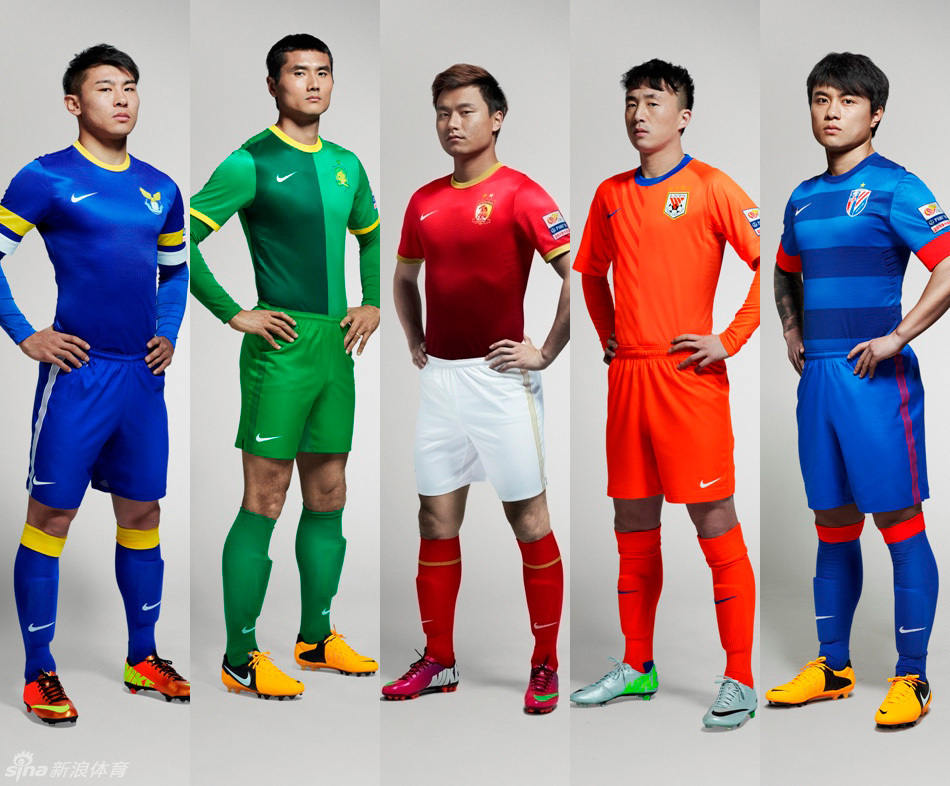
Beijing Guoan: The “watermelon skin” kit of 2011-2012 finally gives way to something new. Dark green has been creeping into Guoan’s designs more and more since they switched back to Nike and this half and half design uses it more than ever. It reminds some of Shenhua’s “Expo” design in 2010, but overall not bad. 7/10
Changchun Yatai: No change since 2011. N/A
Dalian Aerbin: As CSL newboys last season, Nike didn’t have a lot of time to throw together a kit design, so they got plain blue. This time around, they get a touch of color using a similar template as Arsenal. Another unimpressive design, but with Yu Hanchao wearing it, it’s sure to be a good year up north. 6/10
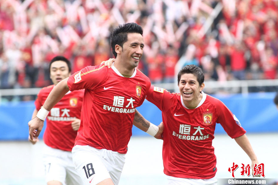
Guangzhou Evergrande: A new collar color, another star, and a slightly darker shade of red are the only changes over last year’s tiger design. Unfortunately, they are keeping the hideous yellow and black away design. 7/10
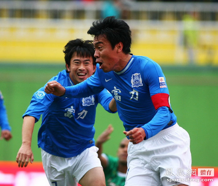
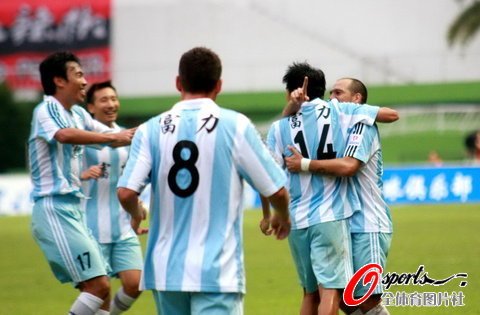
Guangzhou R&F: Like Aerbin, very little time went into designing their kits last season. This year’s stripes is a return to the design they wore when they first moved to Guangzhou in 2011. It’s not half bad, I just hope that they’ll stick with stripes in the future, as the CSL doesn’t have any “traditional” kit styles. 8/10
Guizhou Renhe: Last season a late move and logo announcement didn’t give Nike a lot of time and they were left with a very basic design. This year will see the southwestern side wearing tiger stripes, an interesting choice. Longtime CSL watchers will be reminded that Inter Shanghai, the earlier version of the club, wore striped kits. I’m just hoping this isn’t going to be a one year design. 7/10
Hangzhou Greentown: The last few years it was subtle green stripes for them, leading some fans to argue they out-watermelon’ed Guoan. This time around, they get the Weder Bremen treatment. I like the shirt and especially that they’re the only CSL club that has this style, not too shabby. 8/10
Jiangsu Sainty: No change since 2012. N/A
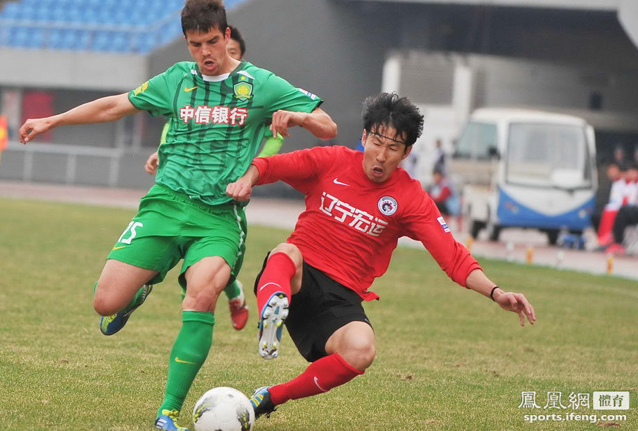
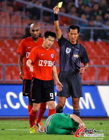
Liaoning Whowin: No change since 2011. N/A
Qingdao Jonoon: We see the “Arsenal template” again, but honestly I like it, the orange and white look great together (maybe a little creamsicle-ish, but oh well). I like the brightness of it and think it’s an upgrade over last year’s kit which used too much black. 8/10
Shanghai East Asia: Boring! The club, long connected with Mizuno, move up to the top flight and get the Nike treatment for the first time, though seems they were treated as an afterthought. 5/10
Shanghai Shenhua: It’s a Nike template, sure, but I love this one, plus they’re the only side with it. It’s a reverse of the PSG design, it looks good in red and blue. In 2011, Nike gave them a unique kit that was probably the best in the CSL and once again, they get a great design. See something different? That’s right, after the recent CFA decision, Shanghai will only be sporting a single star this season. 9/10
Shanghai Shenxin: The most drastic change in the CSL, Shenxin goes from red and black to red and blue (sounds like a different Shanghai team?). This season, Nike’s also had enough time to get their new logo on the kit. Unfortunately, with all that time Nike seems to not have put any effort into it, a very boring kit. 4/10
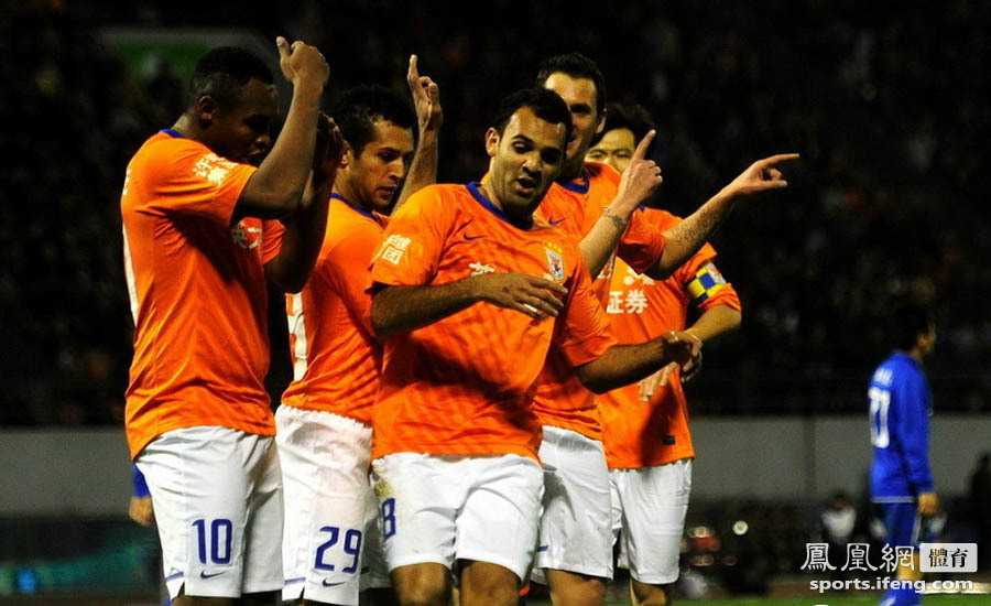
Shandong Luneng: No change since 2012. N/A
Tianjin Teda: Is Tianjin’s home kit color purple or white? For the past few years, they’ve used white at home, from what I’ve seen the white is just the reverse of this purple design. Anyways, the new design, while boring, is surely an upgrade over this. 5/10
Wuhan Zall: It’s basic and boring, but hey, I kinda like it. Amazingly enough, last season’s kits were even plainer, stepping up to the top flight means they get a slight addition of color. Oh well…6/10
Was at the Hengda friendly the other night and saw the new kit on show. I do like it. Hangzhou’s kit takes the biscuits though!
Have to agree there. The Shenhua kit looks fantastic.
Stripey for Fuli! Yet another reason to support them.
Very nice.