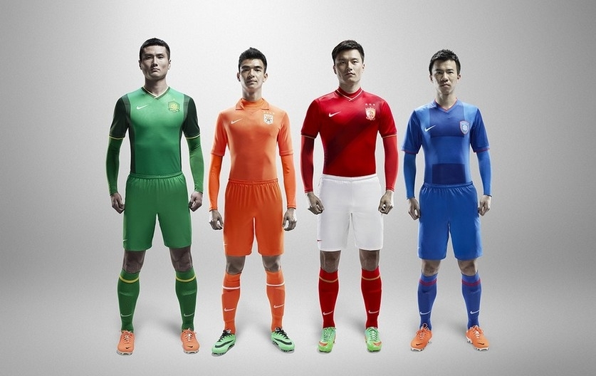
While we won’t get to see these kit designs on the pitch until this weekend, here’s a look at what your side will be wearing in the new year. Nike is in the middle of a ten year deal with the CSL and has gotten bored with a couple of sides, perhaps its because they know those teams aren’t going to buy many replica shirts. Just a friendly note, this year’s “players version” kit is Asian sizing plus a very slim fit, just something for those who are carrying a few extra pounds or (like me) enjoy a few post-match “pops” to keep in mind.
Beijing Guoan – The capital club has been moving away from their old, solid kelly green standbys for awhile, mixing it up with different accent colors and darker shades of green. Last season, they played in a decent looking light/dark green kit with yellow accents. This year continues the double green, overall not a bad look. However, the checkerboard white/grey away shirt is dumped for a solid white top.
Changchun Yatai – Nike’s been really lazy with this northeastern side, but if you’re a cost conscious fan, you’re in luck. This is the third year in a row that Changchun’s kit will remain unchanged, red with some yellow and white accents. If you’re going to keep a look for that long, I guess this isn’t a bad one to have.
Dalian Aerbin – After having completed their maiden year in the top flight in a boring solid blue kit, Nike spiced things up last year with yellow and white, not a bad look, but this year it’s even better, keeping the yellow but switching out white for a light shade of blue on the arm stripes, an improvement over the previous year.
Guangzhou Evergrande – The continental champions get treated better than most, they looked good in 2013, but they will look even better this year, at least at home, their red kit featuring a dark red sash. On the road, they’re ditching the tiger stripes and large collar for something considerably trimmer but still in yellow.
Guangzhou R&F – Last season, the club returned to a striped kit after wearing solid blue for their first season in the CSL. Since you can’t do much with a striped kit (though Nike tries, just look at Barcelona), R&F will keep the same kit this year.
Guizhou Renhe – The league’s lone southwestern side looked good in tiger stripes last season, though they regularly suited up in their white change kit. Unfortunately the striped look only lasted one year as its back to boring solid orange in 2014.
Hangzhou Greentown – What made Hangzhou worthy of a unique template last year? Beats me, but it certainly looked good (though I have a predisposition to green kits). The kit was so nice, they decided to keep it for the 2014 season.
Harbin Yiteng - CSL newboys Yiteng were the only side not to play in a Nike kit last year, instead their plain blue kits were made by Diadora. Nike didn’t spend a lot of time working on a design for them, instead using a common template from last year, plain blue with white sleeve cuffs.
Henan Jianye – Red and green doesn’t sound like the best color combination, but for some reason it tends to look good together on a football pitch, and it really worked for Henan last season as they gained promotion. They keep the same template this year, but gone are the stripes and the green, replaced by white. Despite the step up to the top flight, this kit looks like a step backwards.
Jiangsu Sainty – While Jiangsu looked pretty good last year, in 2014 their kits are even fresher, with less color and a similar template to Guoan, for my money this is one of the better kits we’ll see on a CSL pitch this season.
Liaoning FC – You can’t really complain about solid red and black, it’s a good look though it’s on the boring side. This season they’re using the same template as Aerbin and much like their provincial rivals, it’s a look that works. Of course it will be interesting to see how things are put together when the shorts are added, but from just the top it has to be one of my favorites.
Shandong Luneng – This side’s orange and blue kit was one of the best in the CSL a year ago, could their “fashion sense” be one of the things that helped them finish second in 2013? Nike provided them with a simpler kit for the new season, but this all orange outfit is, well, too orange for me and needs another color to break it up a bit.
Shanghai East Asia – Perhaps Nike didn’t think this side could remain in the CSL last season so they were given a simple design (though its been recycled for Henan this year, perhaps it will become tradition that one of the promoted sides will be given it each year). This season Nike went all out, giving them a two tone red kit that is awesome, with stripes that match the stripes in the club’s badge.
Shanghai Greenland Shenhua – Being located in one of China’s most important cities means Shenhua always get some of the best designs, that was true last year and is equally true in 2014 with a checkerboard design. However, I can’t help but point out how similar the look is to Guoan’s road kit last season.
Shanghai Shenxin – We’ve seen this template before, we’ve also seen this kit before as Shenxin wore it last season, their first in blue. Considering this side is lacking in fans, perhaps Nike just didn’t want to bother.
Tianjin Teda – Granted, I’m a fan of Tianjin’s main rival, but I don’t think I’m out of line in saying their purple kit is one of the CSL’s worst. So much so that Teda has relegated it to an away kit, instead reversing the colors (white with slim purple sleeve band) for their home kit. They are one of the many sides that will keep this design for the new season.