 Though we’re all familiar with the classic Tiananmen and soccer ball CFA logo that has been in place for years, it has rarely found a place on the team’s chest. In the mid/late 1980s, the team made a switch from the older shirts which simply had “中国” (China) on them, replacing that with the flag. From then on, the flag was on pretty much every version of the national team’s kit. Korea and Japan both pushed the flag to the side and instead adopted a crest (Korea was a hold out, not doing it until 2002 when they hosted the World Cup), but China stayed true to the flag.
In recent years, we’ve started to see the logo used more and more, on the kits and especially on the training gear, but while it does have some retro appeal, it looks old, played out. There’s been talk of a new logo a few times, but no changes yet…until now?
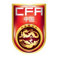
 This new logo was displayed around the stadium in Shanghai during the Olympic squad’s loss to North Korea on Friday (not the best start). While used exclusively in Shanghai, it was used alongside the present CFA logo in Kunming, when the national team took on Uzbekistan on Saturday (and won, 1-0). The logo definitely is a step in the right direction, very modern and marketable, with a dragon and phoenix, important yin/yang symbols in Chinese culture. It’s about time the Chinese team got a dragon logo! The CFA seems to be sticking with the old logo and little mention was made on their official site, though a spiffy new site has been created (it can be found here) and includes plenty of flawlessly written English content, seems like the CFA paid the AFC’s marketing partners World Sport Group a whole lot of money for the rebranding. The design is an interesting rebranding at an unusual time (no major competitions coming up in the near future), but with this logo everywhere, is it finally going to replace the flag?
Bonus information:
 As late as Friday, this logo was spread around Sina’s Weibo and came directly from Sina Sports. It is a mixture of the old Tiananmen/ball logo with the new CFA and China (in Chinese elements). I’d expect that it was an early reject, however in the picture it appears to be placed on an article of clothing. Are we going to be seeing something new or is this a prototype that didn’t make the cut?
The old one looks like the logo on a 80’s beer bottle
I love the old Tiananmen logo… Simple and clean, and the font is beautiful. They should keep it. I’m not a big fan of the shiny business with the dragon and phoenix… too much.